Mapping as Applied Research
Winifred E Newman, Ph.D.1
1Florida International University, Miami, Florida
Cartographers, geographers, and cultural historians acknowledge that existing frameworks for creating and understanding relationships through the map began to change in the mid-twentieth century. Terms like zoning, boundary condition, and master plan no longer adequately describe, catalog, or represent what are now understood as complex, culturally specific contexts and information networks. Additionally, new forms of mapping and new tools for representation allow faster and more data-intensive maps to be assembled. When used as an applied research method in design, mapping reveals a complex of relationships between representation and thinking, technology, culture, and aesthetic practices. With the aim of developing more effective ways to employ mapping, I offer a mapping course to students across disciplines that looks at maps in relation to the cartographic histories associated with different forms of the map and the relationship of these maps to an idea or place. This paper shares a method for mapping that emphasizes an understanding of the map as a strategy for the visualization of data and ideas. I show examples of student work using the tools learned in the course. Embedded in the pedagogy are terms used to organize effective maps that construct varied possible worlds by translating from one set of conditions, or constructs, to another through correspondence. Addressing maps as texts, objects of historical explanation, projections of new worlds, and a form of research, students gain a better understanding of spatial and ideational practices.
KEYWORDS: Mapping, Data Visualization, Representation, Design
INTRODUCTION
The term ’mapping’ travels across disciplines, acquiring varied definitions and, therefore; utilities. The question is, how can we define and instrumentalize mapping in design? A quick review of current theory in map–making and mapping provide some insight, but as with all experiments, reliability and testing are in order if we want to be able to transmit a working method. This paper will review the idea of mapping, propose a working definition, and share a methodology tested over the course of six years in design studios and a seminar on applied mapping. Definitions of the term mapping range from early usage in surveying as a synonym for plotting or protracting to mathematics where mapping is the correspondence between each element of a given set with each element of another. Similarly, in linguistics the emphasis is on the correspondence between associated elements of different types. In the humanities the spatial turn of the late 1960s inaugurated revisionist histories leading to a revaluation of context or place as the site of events lead by French theorists Michel Foucault, Maurice Merleau-Ponty and Paul Virilio who formulated an instrumental relation between place, people and power. In geography and eventually cartography, the emphasis shifted to “territoriality” and theories of power and space. Cultural historian Denis Cosgrove differentiates maps and mapping: the latter, once understood as a weak synonym for cartography, is more recently defined through process, specifically the process of projection. Mapping is an act that creates, visualizes, and conceptualizes a possible situation, as much as it records, represents or describes one (Cosgrove, 1999) or as Jean Baudrillard notes the territory no long precedes the map, nor does it survive it, ’the map precedes the territory’ (Baudrillard, 1994). The generally accepted definition of mapping in geography and cartography is ’a description of the milieu’ easily applied to genetic code, certain mathematical concepts, or sonar maps that create a correspondence between sound and the rise and fall of a seabed topography (Robinson and Petchenik, 1976). As a ’graphic representation of correspondence between two spaces, whose explicit outcome is a space of representation,’ mapping is, as Cosgrove reminded us, a deceptively simple activity (Cosgrove, 1999).
1.0 MAPS AS OBJECT OF EXPLANATION
Maps are parenthetical—that is, maps frame what you want to hold apart from the real in the world. The map does this by creating conceptual representations of the milieu by means of symbols and relations between symbols. This symbol correspondence is termed the index by cartographers, but it is the same representational strategy as correspondence, the difference only becoming evident when the map describes a spatial milieu. Unlike the symbols of language, the spatial map as a code derived from graphic symbols and it is from these that it’s particular ambiguity or indeterminacy derives. It is this indeterminacy that allows maps to operate as qualitative and/or quantitative research instruments.[1]
Borrowing from French theorist Roland Barthes semiotic strategy with language and myth, the following semiotic structure explains how the map can be both a sign and a signifier—that is, the map is a more of a strategy for signification than a collection of signs.
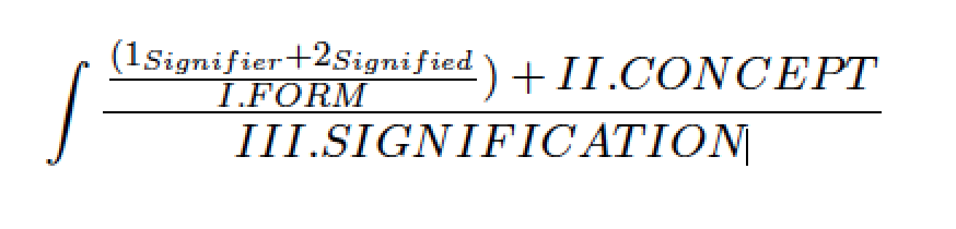
(1) Semiotic Ordering (Author following Barthes, 2010)
In this organization signifier and signified equate to image, e.g. shapes of the continent in the northern hemisphere, while ‘concept’ is all possible meanings associated with that image: United States, Finland, Sweden for example. The second level of ‘signification’ is the way the image is construed once it is located in a context. Looking at Figure 1 illustrates this difference: in the Mercator projection, the map effectively positions those countries as the center of the globe, thus the center of power.
Maps take signs, that is, anything that communicates (word, image film) with a literal meaning, and use them to stand in for something else such that the original sign becomes part of a new sign (Barthes, 1993). Using two different representations of the world map will illustrate the way this works. The Mercator projection (1569) by the cartographer Gerhard Mercator privileges ocean area. The Mercator map makes it possible for a ship’s navigator to use rhumb lines or constant sailing courses that cross all meridians of longitude at the same angle to navigate the worlds oceans (Fig. 1).

Figure 1: Mercator projection (left) and the Gall-Peters Projection (right).
The Gall-Peters map (1855) is an equal-area projection and privileges land mass. Continents in the Gall-Peters projection are arguably more correct for land area than the Mercator map. Both maps correspond to different features of the globe, but their utility as world maps is the same. The second level of signification is found in the utility of the maps as instruments of political power. The Mercator projection continues to this day as the normative representation of the globe, regardless of its original use (for sea travel), while the Peters projection remains relatively obscure. This is not surprising given that the western hegemony as the dominant territorial powers would be undermined somewhat by the Peters more accurate depiction of the southern continents.
For a moment let us take a phenomenological turn and borrow Husserl’s notion of intersubjectivity in order to understand how maps activate a relationship between two discreet conditions, sets, or domains. For Husserl, the term applies to the indeterminate relation between the subjective worlds of appearances for the individual–self and the shared subjectivities of other embodied subjects (Husserl, 1964). The world as a field of appearances is not a solitary realm, but a shared realm inhabited by multiple bodies in space. And it is these intersubjective relations occurring as spatially dependent phenomena between these bodies that we characterize as identities. That is, identities are always constructed in relation to. In mapping, these subjects become the subjects in the map and the world of the map re-creates these subjects through distinctions or differences, not through negation, but through a positive dialectics. That is, the context of the map is both the ’subjects’ in the map that the mapmaker brings into focus and the subjects used at the periphery to sustain the totality of the mapped representation.
2.0 KEY CONCEPTS AND TERMS
Colin Rowe introduced the figure-ground diagram (really a map) borrowed from Gestalt psychology as a way to reinforce the dependence of part-to-whole, or in the case of the city: object to field, solid to void. For Rowe the map represented the field of the city as polis, and the political sphere it implies, expressed as a dynamic relation between built/un-built, public/private (Rowe, 1978). It is in use now to describe urban density.
Building on Colin Rowe and others, including Kevin Lynch who introduced ’cognitive mapping’ into urban design (Lynch, 1960), Kenzo Tange’s use of photogrammetry in the Tokyo Bay Plan (1961), architects, urban designers and map-makers from a multitude of disciplines who instrumentalize the map, I developed a methodology for architecture students to use mapping as a strategy of secondary signification to build correspondences between their observations and real-world conditions, or their concepts and possible physical or perceptual analogues. The mapping methodology we use is not limited to the physical or material, but can applied as well to represent an idea or a concept. It allows students to calibrate their understanding through by translating from one idea or condition to another. Depending on the subject of their map, the data will be quantitative—that is, based on numerical measurement or qualitative which highlights a correspondence between qualia or the subjective properties of experience (Thomas, 2003).
The terms outlined in the following section are part of the representational structure of maps. They help identify key mechanisms imbedded in all maps. The presence of a structure also distinguishes maps from diagrams that are similar to maps in kind, but not degree. Diagrams do not quantify or qualify spatio-temporal relationships. Diagrams are ’simplified figures to convey essential meaning,’ whereas maps tend toward robust meaning relative to the subject (Hall, 1996). The symbols in a diagram have multiple significations until we specify, or point to their context using an index. They are themselves indexical, i.e. they point to something, but they are not indexed: they are not ordered or organized within a larger context, nor do they have a temporal or spatial scale.
2.1. Frame, Relative Scale, Axis, Index and Time
The five operative terms necessary to the organization of the map are: 1) frame, 2) relative scale, 3) axis of translation, 4) index, and 5) time. In order to explain the terms I will use examples from a variety of sources. In the Case Studies section of this paper we will look at specific examples in depth.
The first term is the frame or the literal and conceptual demarcation of the map: it denotes inclusion or exclusion. Making a map begins with an observation which is both a thought about thinking and the object of thought itself. The undifferentiated world cannot be apprehended therefore, all maps have a frame whether applied to a concept or a cosmography. This is one of the first principles of a map identified by the Milesian philosopher Anaximander (c.610-c.546 BC). The second term, relative scale is controlled through the geometries of projection and includes scale and all scalar relationships. All architecture drawings are by definition maps as they describe a milieu through and employ relative scale using geometries of projection. The third term is the axis of translation or the rotational plane at which the mapped representation is viewed. This is usually either horizontal or vertical. The former associated with rationalized spatial orderings like the orthographic geometries and the latter with perceptual or perspectival views. Not all maps include every term. For example, genetic maps do not depend on the axis of translation, protein sequences.
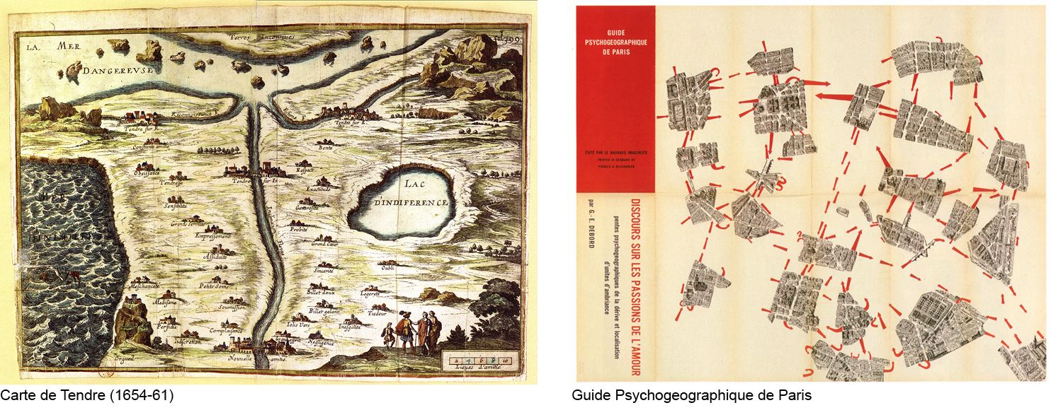
Figure 2: Comparison of the Carte de Tendre (left) and the Guide Psychogeographique de Paris (right) (Author, 2012)
The index, or forth term, is the legend or key of the map. These are the signs of the map that point to specific content. The Carte de Tendre (1654-61) is a thematic map describing the journey of love by pointing to or indexing geography of rivers, seas, and mountains to seventeenth century morays on love. It’s contemporary equivalent is Guy Debord’s Guide Psychogeographique de Paris: Discours sur les Passions de L’Amour (1957) (Discourse on the Passions of Love) that uses a graphic arrows and bits of a Parisian tourist map to describe the territory of aimless wandering practiced by the Situationist (Fig. 2).[2] Debord’s map is also an example of a cognitive map similar to Lynch’s, but rather than a utopian image of the city that reinforces a sense of place, the Situationists’ map suggests a resistance to the underlying ordering structures of the city (Debord, 1973).
The fifth term is time and it can be either synchronic or diachronic in the map. The synchrony of time in the map is the date of the maps’ creation and the time in the map, but it may also work diachronically where the map may also describe a temporal event. Kevin Lynch’s cognitive maps from a View from the Road work this way. The cognitive map he projects in the Boston Highway project unfolds through the perceptual space of the viewer as they move through the city on the highway (Appleyard, 1964). This is a linear progression of experience and, therefore; controlled through time.
3.0 CASE STUDIES
The following are a series of case studies from an applied mapping course taught by the author. The maps students make range broadly between quantitative and qualitative analysis and include thematic, choreographic, ichnographic and topographic maps to name a few. The following selections illustrate the capacity of the map through measurement, however relative, to act as a scientific document. Mark Monmonier, famously showed that not only do maps lie, they must.[3] All maps are, by definition, reduced models of reality and as such, reflect a mapmakers dialogue with the world around them. The goal of the course was to teach students how to communicate effectively through the map. Exercises and readings focused on the necessary grammar and syntax of map making.
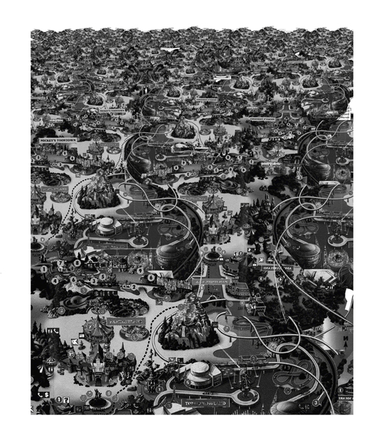
Figure 3: An example of the un-mapping exercise. The original map is the tourist map given at Disneyland, California. Disneytopia (Betty Ng 2008)
This is a graduate level course offered over the last five years in architecture. The format of the course is a seminar workshop meeting three hours a week. The emphasis is not on technologies used to make maps (GIS, mathematical projection, CAD programs), rather on maps as representational strategies. Students are encouraged to use whatever technology is appropriate to the subject of their map. Students read a variety of texts, from the history and theory of representation to specific cases of mapping in architecture.
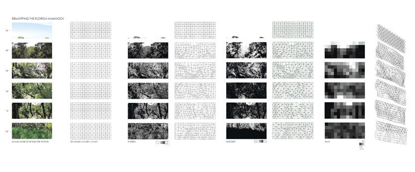
Figure 4: Canopy_Florida_11.09.09, 10:00AM (Sara Johnson, 2010)
Students complete two mapping projects over the semester-long course. The first project is a un-mapping exercise in which students 1) choose one of five pre-selected maps, 2) deconstruct the map to understand how it is organized, then 3) reassemble the map according to a particular thematic (FIG. 3). The final research project is the construction of a new map using a data set assembled by the student. There are no restrictions placed on the choice of data or how it is to be organized, but the final representation must conform to the terms outlined in the mapping methodology.
3.1. Orthographic Projection: Canopy_Florida_11.09.09, 10:00AM
Sara Johnson’s Canopy_Florida is a thematic map that looks at the density of foliage (Fig. 4). The map frames a narrow slice of Floridian understory at a particular time of day and then calibrates the density from light to dark. The goal of the map was to evaluate an existing natural condition in order to calibrate an artificial response, in this case, the design of a shading device.
The map outlines the sequence of translation from original canopy condition to reformulated density. Using a photograph, the student projected a rationalized grid in order to fix the position of the data. By translating the original photograph into a high-contrast image and then mapping the data on the grid, the map allows for the construction of a new value-set. The value-set is re-projected onto the grid using a set of predetermined parameters to inform an alternative reading of the relative density of light to dark in the original condition. Sara also tested an alternative reading of the density as a color mapping. Finally, the z-axis translation is projected as a 3-D lattice structure in the final translation of the original perceived densities.
The final mapping was used to inform the design of an artificial canopy intended to mitigate the natural canopy of the Florida site. The mapping is effective because the mapmaker is specific about the data and translations. Similar to sonar maps that translate one data set (sound) to another (graphical index) to describe a third condition (terrain) this map translates an original image made using light (photo) to a density reading and finally a three-dimensional representation of a new perceptual terrain.
3.2. Perceptions of Space: Everchanging Frame and GIS Data_scape
The two maps shown focus on how we perceive space. The first uses two axes of translations: the plan-view that ordered by orthographic geometries and the perceptual view organized by the perspectival optics of the camera lens that captures what the observer sees through the lens. The second map describes the contours of a scene using a GIS data-set where the z-axis is given value in proportion to the amount of tone change from one color to another.
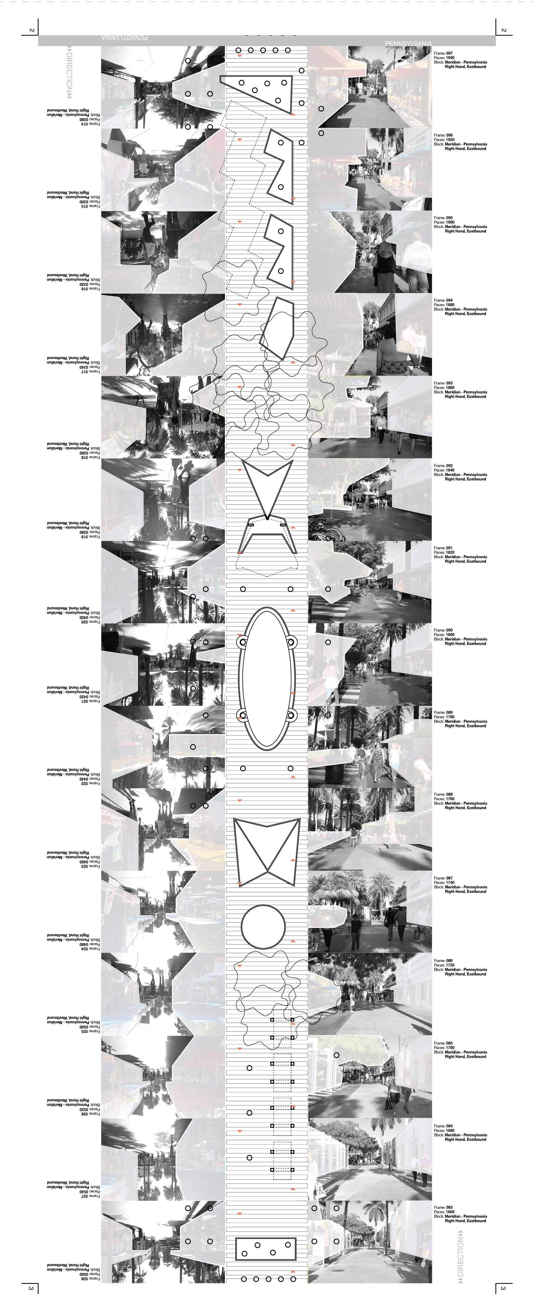
Figure 5: Everchanging Frame (Daniel Alonso, 2010)
Everchanging Frame: One Lincoln Road Experience (Fig. 5) is one of 14 sheets from a folio. The analysis is a qualitative mapping describing the spatial frame on Lincoln Road in Miami, Florida. The data set is a compilation of 110 photographs taken at 20 pace intervals. Overlaying the frames is a conceptual screening of the positive and negative space of Lincoln Road shown in perspective enforces the compressive and expansive quality of the actual space.
The second map (Fig. 6) addressed the how it is that we perceive a scene using theories of perception from ecological psychology. The questions were 1) how are you seeing, and 2) how to measure what you are seeing. Cognitive psychology argues that visual perception is a function of an indirect and rationalized perception of reality. In contrast the work of psychologist James J. Gibson argued for a direct realist approach to visual information acquisition where the environment is understood to provide all the information necessary to specify it’s properties (Gibson, 1979). Gibson’s ecological approach emphasizes the direct experience of the world as mapped by the visual cortex. Using a similar approach Lysa Janssen’s GIS Data-Scape map proposes that the raw data of a visual image (in this case a photograph) can be treated as a visual field of color to be re-projected using GIS software.
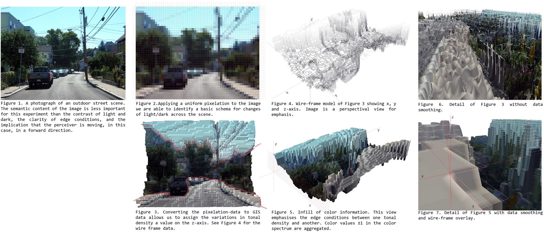
Figure 6: GIS Data-scape, (Lysa Janssen, 2008)
The first step in the process is the pixilation of the original image after which pixels are converted into bands of color abstracting the image to its most basic color data. A second iteration converts the pixilated image to a set of densities depending on a pre-selected range of values from light to dark. The new mapping translates one set of data (light) to a three-dimensional landscape. This is not a strictly ecological approach as intended by Gibson; rather it plays with data sets and demonstrates the malleability of our technologies and assumptions about the way perception operates.
3.3. Thematic Maps: Chronotope of Babel and Distributing Dynamics
Gia Wolff’s Chronotope of Babel is a thematic mapping of the short story “The Library of Babel” by Argentine author Jorge Luis Borges (Fig. 7) In the story the universe is presented as a vast library containing only 410-page books. Borges imagines the spatial organization as an infinite field of interlocking hexagonal rooms. Wolff’s map chronicles the time-space of the narrative of the story or what literary theorist Mikhel Bakhtin designated a chronotope. The term describes the spatio-temporal link controlling the structure of any given narrative or speech act. All stories take place somewhere and in sometime. In the case of the “Library of Babel,” the narrative unfolds in relation to the hexagonal units of a library as described by Borges’ narrator, the ‘traveller.’ (Borges, 2000)
The underlying layer of the map is the text of the book “folded” corresponding to the overlap of the events of the story linked to the space in which they occur. The frame of the map is the limit of Borges essay or the internal time of the story in relation to its imagined space. Unlike the text in which the ordering principle is language and syntax, the map is ordered by the hexagonal figure of the library and the sequence of the story as told by the narrator. It was important that neither time nor space was privileged, as this is part of the definition of the chronotope according to Bakhtin and was also deemed important by the mapmaker. Ultimately the map is a translation of Borges dys-topic world in which neither space, time, or language are stable.
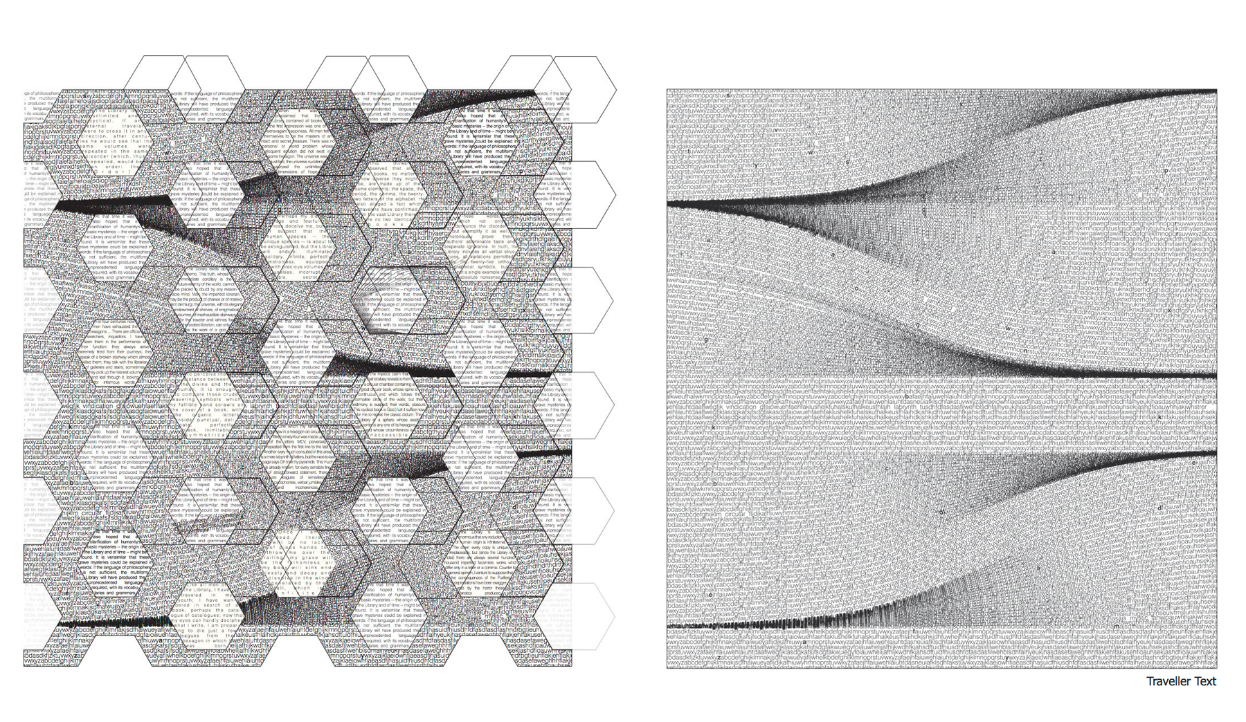
Figure 7: Chronotope of Babel (Gia Wolff 2008)
The map, Redistributing the Dynamics of the World explores the relationship between time and distance by reordering the world according to the time needed to travel from one location to another via the airplane (Fig. 8). Buckminster Fuller’s AirOcean World Map (1946) proposed a similar reordering of the world based on the transport of goods and people through airplanes. But where Fuller used a new projection of the three-dimensional globe as sections of an icosahedron, Siliang Fu’s map simply moves the existing landmass as a function of the time to distance relationship based on air travel and telecommunications. The map offers three versions of the world: past, present, and future. In this new world map, the world is not only perceptually smaller, but literally shrinking.
CONCLUSION
Making a map begins with an observation which is both a thought about thinking and the object of thought itself. The undifferentiated world cannot be apprehended. The map can isolate data without fully disrupting imbedded relationship of that data to all other data. The map allows us to slip between whole and part, object and subject, point and field, or identity and non-identity on a continuum, rather than as sets or categories which are necessarily defined by contrast, or difference. This positions mapping as an effective tool for managing the complexity of observations often associate with design in the spatial disciplines. Maps organize qualitative and quantitative data according to the theoretical framework of the mapmaker. Mapping is the collective set of practices that structure correspondence between physical phenomena, lived experience, or conceptual frameworks. To paraphrase Lord Kelvin who famously noted that to measure something is to understand it; to map something is to structure it.

Figure 8: Redistributing the Dynamics of the World (Siliang Fu 2010)
ACKNOWLEDGEMENTS
All student maps produced 2008-2012 by students enrolled in the seminar entitled Applied Mapping taught at Washington University in St. Louis, Harvard University, and Florida International University.
REFERENCES
- Abrams and P. Hall. 2006. Else/Where Mapping: New Cartographies of Networks and Territories. University of Minnesota Design Institute: Minneapolis, MN.
- Appleyard, K. Lynch, and J. R. Myer. 1964. The View from the Road. Published for the Joint Center for Urban Studies of the Massachusetts Institute of Technology and Harvard University by the M. I. T. Press: Massachusetts Institute of Technology, Cambridge.
- Baudrillard. 1994. Simulacra and Simulation. University of Michigan Press: Ann Arbor.
- L. Borges, E. Desmazèires, A. Hurley, and A. Giral. 2000. The Library of Babel. David R. Godine: Boston.
- E. Cosgrove. 1999. Mappings. Critical views. Reaktion Books: London.
- Debord. 1973. Society of the Spectacle. Detroit.
- J. Gibson. 1979. The Ecological Approach to Visual Perception. Houghton Mifflin: Boston.
- Husserl. 1964. Cartesian Meditations. M. Nijho.
- Lynch. 1960. The Image of the City. Publications of the Joint Center for Urban Studies. Technology Press: Cambridge.
- H. Robinson and B. B. Petchenik. 1976. The Nature of Maps: Essays toward Understanding Maps and Mapping. University of Chicago Press: Chicago.
- Rowe and F. Koetter. 1978. Collage City. MIT Press: Cambridge, Mass.
- Thomas, R. Murray. 2003. Blending Qualitative & Quantitative Research Methods in Thesis and Dissertations. Corwin: Thousand Oaks, CA.
ENDNOTES
[1] The argument for a ‘multimethod’ approach in the social sciences bodes well for using maps in combination with additional tools including surveys, experiment, and field observations. The key is to control the selection of method primarily by the researcher’s theoretical formulation of the problem, and ‘only secondarily by methodology.’ See J. Brewer and A. Hunter. 2006. Foundations of Multimethod Research: Synthesizing Styles. Sage Publications: Thousand Oaks, Calif., pp. 64.
[2] The original map was an engraving by François Chauveau as part of a novel by Madeleine de Scudéry’s novel Clélie (1654-61).
[3] M. S. Monmonier. How to lie with maps. University of Chicago Press, Chicago, 2nd ed edition, 1996.
acknowledgments
The original paper is published in the proceedings of the 2013 ARCC Spring Research Conference, The Visibility of Research
Architectural Research Centers Consortium
